Crafting Viome’s Brand Identity and Designing for Sustainable Growth
Client
Viome
Roles
Design Director
Lead Designer
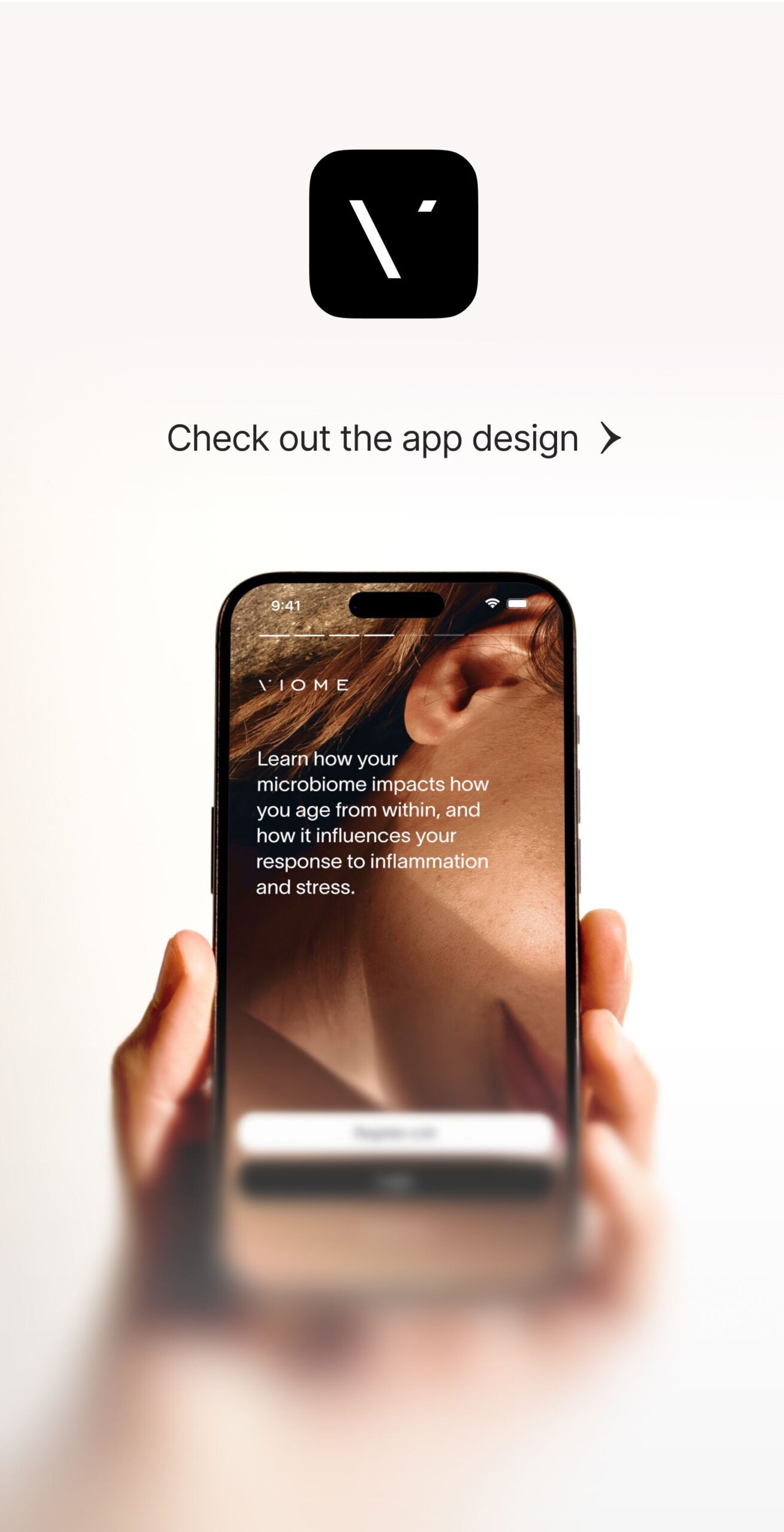
Viome is a pioneering health-tech company delivering personalized wellness solutions—from at-home microbiome tests to AI-driven supplements. As a fast-scaling Series D startup, Viome had breakthrough potential but faced critical branding challenges: fragmented identity, inconsistent execution, and no creative infrastructure to support growth. This case study showcases my leadership in transforming Viome into a unified, scalable brand—building systems that delivered measurable business value and creative excellence.
Note: All work featured in this case study was created or directed by me during my time leading Viome’s brand and marketing design. In 2024, I transitioned into a new role. Current creative work at Viome is led by a different team and may not reflect my direction.
0%
Boosted website conversion rates, directly enhancing revenue and customer acquisition.
100%
Reduced email design production time by half through modular templates and streamlined workflows.
100%
Increased design team productivity through strategic implementation of a robust digital design system.
0%
Achieved consistency across all digital, print, and packaging touchpoints, building trust and brand loyalty.
The Challenge
When I took over Viome’s brand and marketing design, the company was growing fast—but its creative foundation hadn’t kept pace.
Fragmented Brand Expression
Multiple designers and agencies had produced disconnected assets, leading to a fractured customer experience. There was no clear visual or verbal identity across touchpoints.
Underperforming Marketing Assets
Campaigns lacked cohesion and were difficult to iterate or scale. Creative decisions were made in silos, without insights from data or testing.
High Demand, Low Resources
Viome’s growth strategy required producing hundreds of assets a month—across email, ads, web, and social—with a lean team and tight budgets.
A Brand That Had Outgrown Itself
The company’s focus was evolving—from a single test kit to an ecosystem of premium, personalized wellness solutions. The brand needed to signal credibility, clarity, and science-backed innovation.
Finding the Root Cause
I began with a company-wide diagnostic. This included: 1. Interviews with marketing, content, and executive stakeholders to align on business goals; 2: One-on-ones with every designer to surface process gaps and team pain points; 3. A full audit of creative workflows, asset performance, and brand touchpoints. Three core challenges emerged:
Narrative Fragmentation
Viome’s expanding product catalog (including future categories like personalized cosmetics) required a brand flexible enough to support multiple stories without losing clarity.
Operational Inefficiency
Asset creation was inconsistent, manual, and unscalable—hampering speed and quality under high production pressure.
Trust as Table Stakes
Viome’s products require long-term user commitment. To retain customers, the brand needed to build credibility from the first interaction—visually, verbally, and experientially.
The Strategy
I approached the rebrand as both a creative and operational redesign—one grounded in research, team empowerment, and measurable business outcomes.
Collaborating with a brand and marketing researcher, we defined Viome’s core user: a scientifically curious, wellness-driven consumer seeking clarity, consistency, and evidence-backed health solutions.
Internally, I drove a cultural shift: from a top-down, manager-led team to a designer-led culture—where creative leads owned their work, collaborated cross-functionally, and thought strategically.
Translating Strategy into Execution
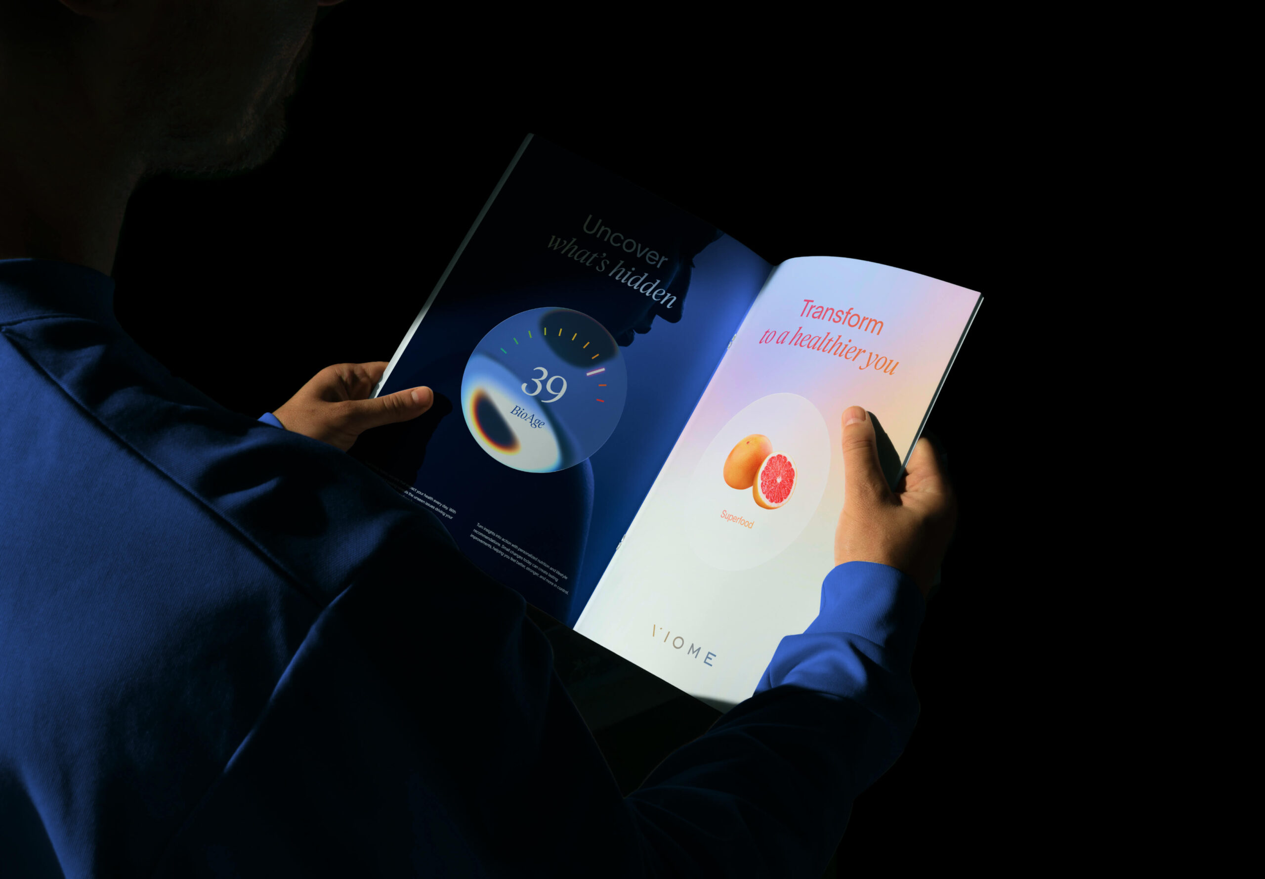
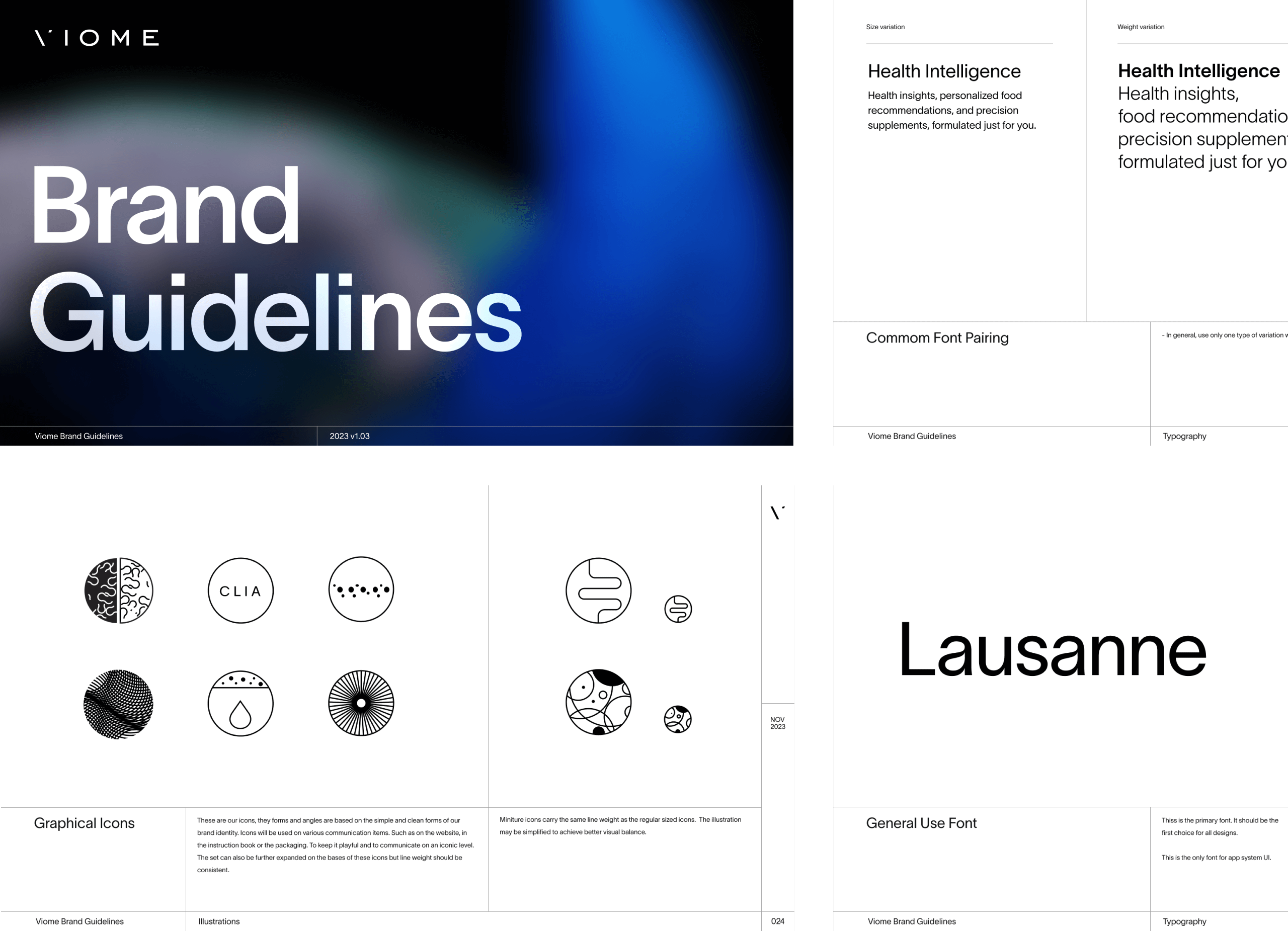
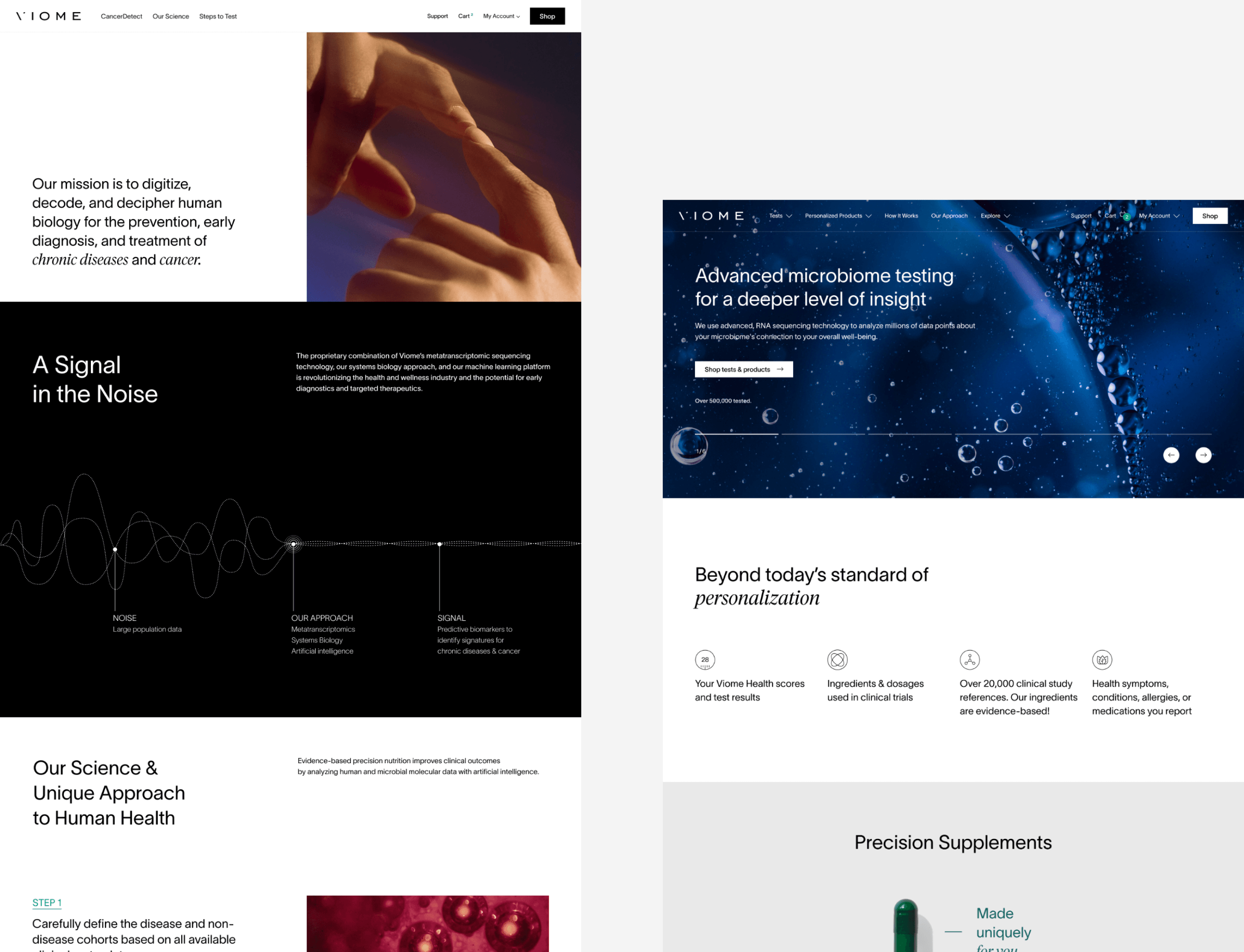
A Cohesive, Scalable Visual Identity
Viome’s business was evolving rapidly—from a single product to a growing ecosystem of health-tech solutions. The brand needed an identity system that could scale with that ambition: flexible enough to support a diverse portfolio, yet cohesive enough to build lasting recognition.
We approached the identity not as a static set of rules, but as a dynamic design language—one that could adapt, evolve, and respond to context without losing its center.
Where traditional branding often builds recognition through rigid constraints (hero colors, a fixed layout system), we designed Viome’s identity for the realities of modern, digital-first storytelling. In today’s landscape of infinite scroll and constant noise, consistency is no longer about uniformity—it’s about coherence.
Rather than tethering the brand to one color or a narrow visual formula, we anchored recognition in structure: a strong typographic voice, disciplined layout systems, and a refined yet flexible logo architecture. This gave us a foundation to experiment with a broader visual range—treating color as an expressive tool, not a limitation.
The result is a brand system that behaves more like a person than a product—recognizable in its core identity, yet capable of showing up differently depending on the moment, the medium, and the message. It’s not about looking the same everywhere—it’s about feeling unmistakably Viome, always.
A Visual Language Inspired by Wuxing Philosophy
Viome’s brand narrative is uniquely multidimensional—spanning food, chronic conditions, AI, technology, microbiology, lifestyle, and more. Most brands tell a single story. Viome tells many. The challenge: how do you visually express such a complex story without collapsing under visual inconsistency?
Rather than forcing every element to look the same, I took the opposite approach—leaning into contrast as a strategic device. I believed that difference could become the unifier. This philosophy echoes the work of architects like I.M. Pei and Frank Lloyd Wright, who embraced contrast—between material, form, and environment—not as fragmentation, but as a way to create balance, tension, and cohesion. Similarly, I sought to design a brand system where distinct visuals could coexist—each with a unique voice, yet all contributing to a larger, unified narrative.
To do this, I conducted a narrative analysis and distilled Viome’s brand story into five foundational pillars:
Technology
The human inventions & AI
Food
The inputs we consume
Biology
The internal systems and microbiome
Human
The physical & emotional being
Nature
The environment and its impact
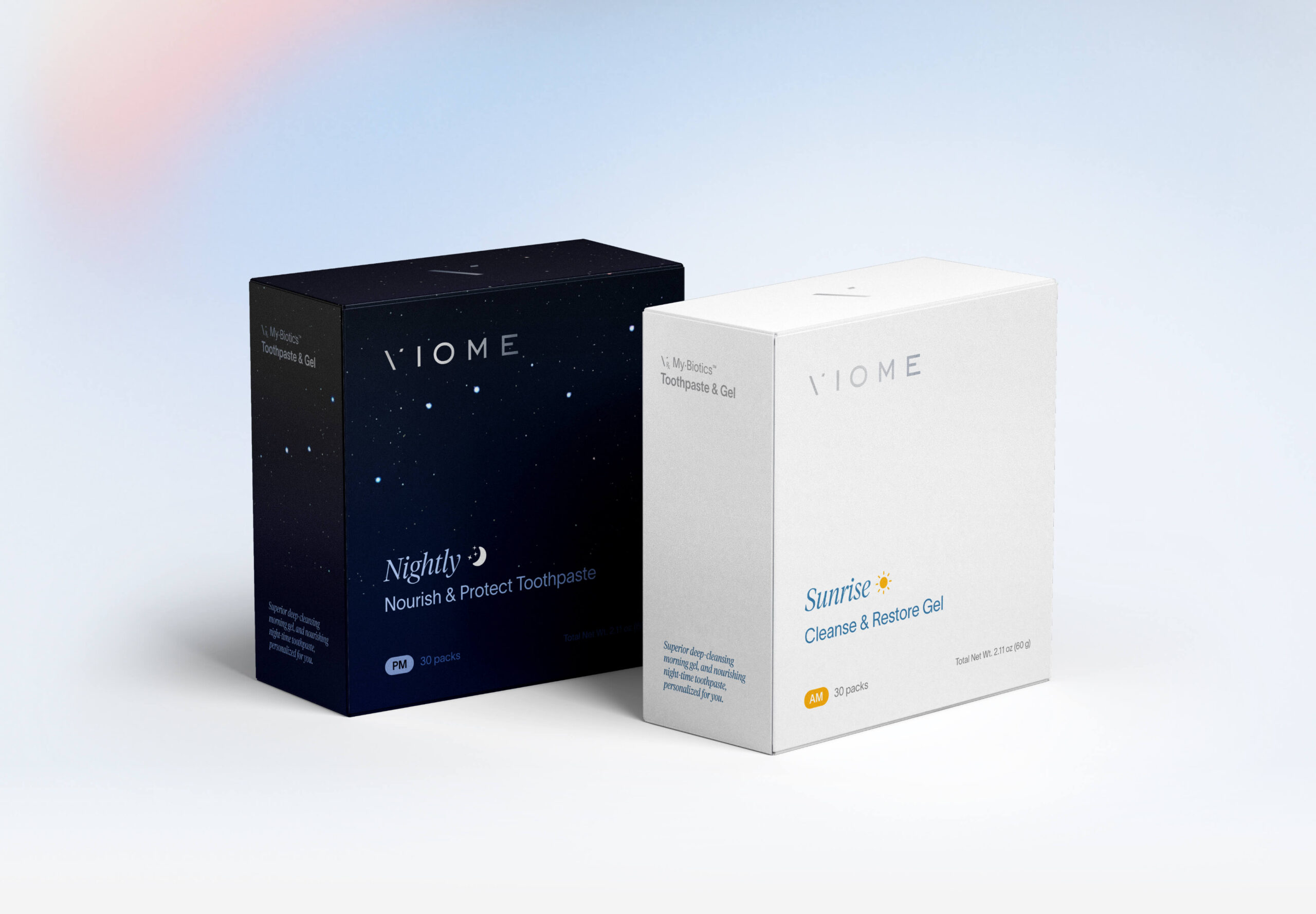
These five themes orbit the individual—creating a holistic, balanced image of health. To express this system visually, I turned to the Chinese philosophy of Wuxing (Five Elements). Each brand pillar was mapped to one of the elements, each with its own distinct aesthetic language:
METAL (金)
Equipment & Precision
Technology
WOOD (木)
Growth & Vitality
Food
WATER (水)
Origin of Life
Biology
FIRE (火)
Life & Energy
Human
EARTH (土)
Human & Nature
Nature
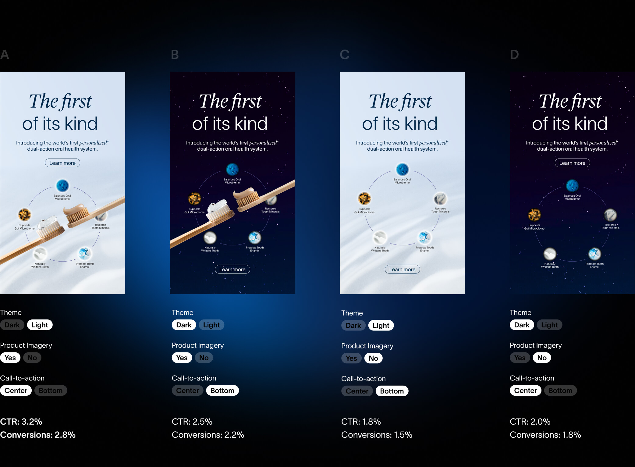
Creative Testing, Backed by Data
To improve the performance of Viome’s digital advertising, I introduced a hypothesis-driven design strategy rooted in data and experimentation—mirroring how modern product teams validate features.
We identified key design attributes (e.g., use of product imagery, visual theme, CTA placement), created structured ad variants, and ran A/B tests to isolate the impact of each element on performance metrics like CTR and conversion.
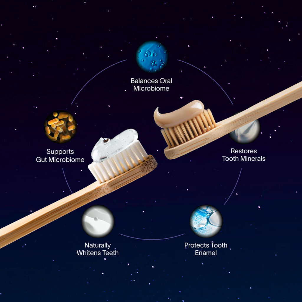
For example, during the launch of My·Biotics Toothpaste, we tested four ad variants by adjusting three attributes: product photo presence, light vs. dark theme, and CTA placement. Results revealed that:
Product imagery significantly improved engagement
Light themes outperformed dark ones across CTR and conversions
Mid-positioned CTAs had a slight performance edge
These insights, repeated across multiple campaigns, informed a creative framework that guided future executions. By building a repeatable testing loop, we turned ad design into a measurable, iterative process—enhancing effectiveness while reducing guesswork.
Modular Design Systems for Creative Scale
To meet the demands of a fast-growing DTC brand, Viome needed to produce high volumes of creative—quickly, consistently, and at scale. But rather than approach this as a production challenge, we built a modular design system to solve it strategically.
We developed a flexible set of branded components—headlines, layouts, image styles, CTAs—that could be reused and remixed across ads, emails, landing pages, and more. This system enabled rapid asset creation without compromising brand integrity.
Each module was crafted with a shared visual language—unified by typography, grid, hierarchy, and motion. The result:
Faster production with fewer resources
Consistent design across every touchpoint
A framework for ongoing testing and iteration
This approach transformed our team into a high-output creative engine—able to adapt quickly, maintain quality, and evolve the brand through systemized creativity.
Outcomes & Impact
This was not just a visual redesign—it was a systems transformation, delivering tangible business value:
$4M+ Estimated Annual Value
Derived from increased revenue, reduced agency dependency, and improved brand equity.
150% Increase in Creative Output
Modular systems enabled our small team to meet growing content demands—delivering more & faster.
Brand Built for Growth
The identity and systems are future-proofed to support Viome’s evolution into new verticals and global markets.
A Culture of Creative Leadership
Designers now lead—not follow—shaping strategy, driving ideas, and owning outcomes.
Viome’s leadership highlighted my contribution, noting:
"Your leadership and expertise have been instrumental in driving our team to new heights... The new brand guidelines and design systems provided the agility needed to stay ahead of the competition and meet our evolving business needs. Thank you for your vision, positive mindset, and transformative impact."
Looking forward, I now lead Viome’s next big thing: digital product design, shaping the next generation of personalized wellness experiences. The systems, strategy, and culture I built continue to fuel Viome’s growth—and serve as a foundation for its future.
Current creative work at Viome is led by a different team and may not reflect my direction. If you’d like to see more of my work besides what’s on this page, feel free to reach out.
For nearly a decade, I led CKGSB’s international design efforts. From website to marketing campaigns, we tailored elite visual experiences that honored both Eastern nuance and Western expectations for a global audience.
Viome
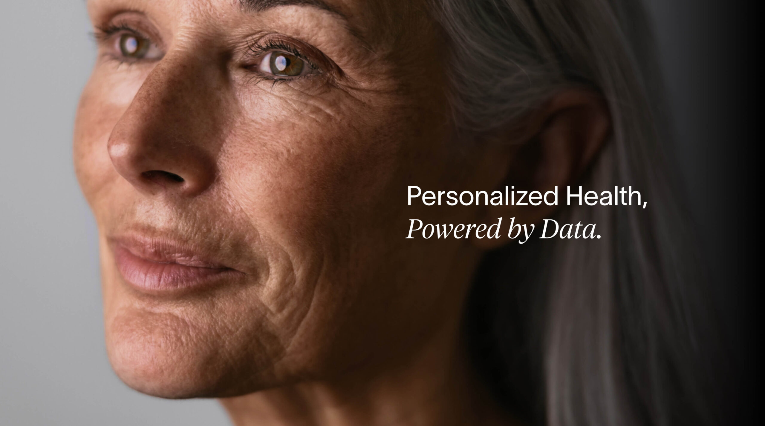
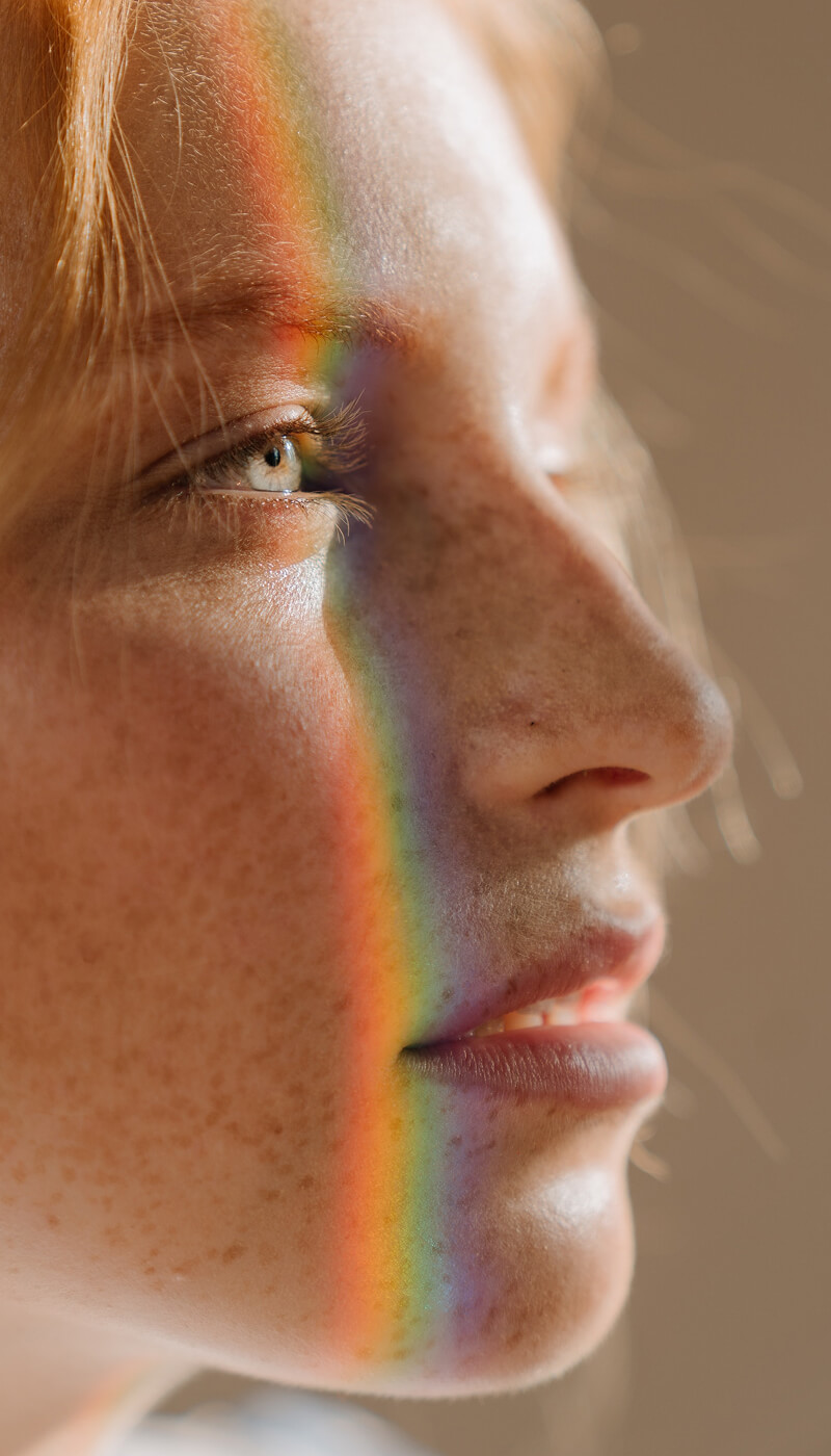
We’re actively integrating AI into our design process—analyzing research, generating ideas, editing visuals. This Viome visual blends human intuition with AI power, pointing toward the future of hybrid design.
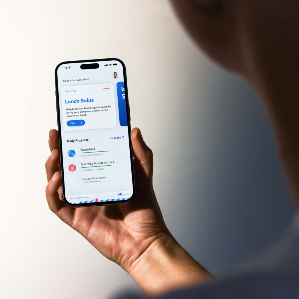
Eli Lilly
As one of the designers on Eli Lilly’s insulin pump project, I helped redesign the Type II diabetes experience. Our goal: a simple, empowering daily tool that educates users while guiding them through treatment transitions.
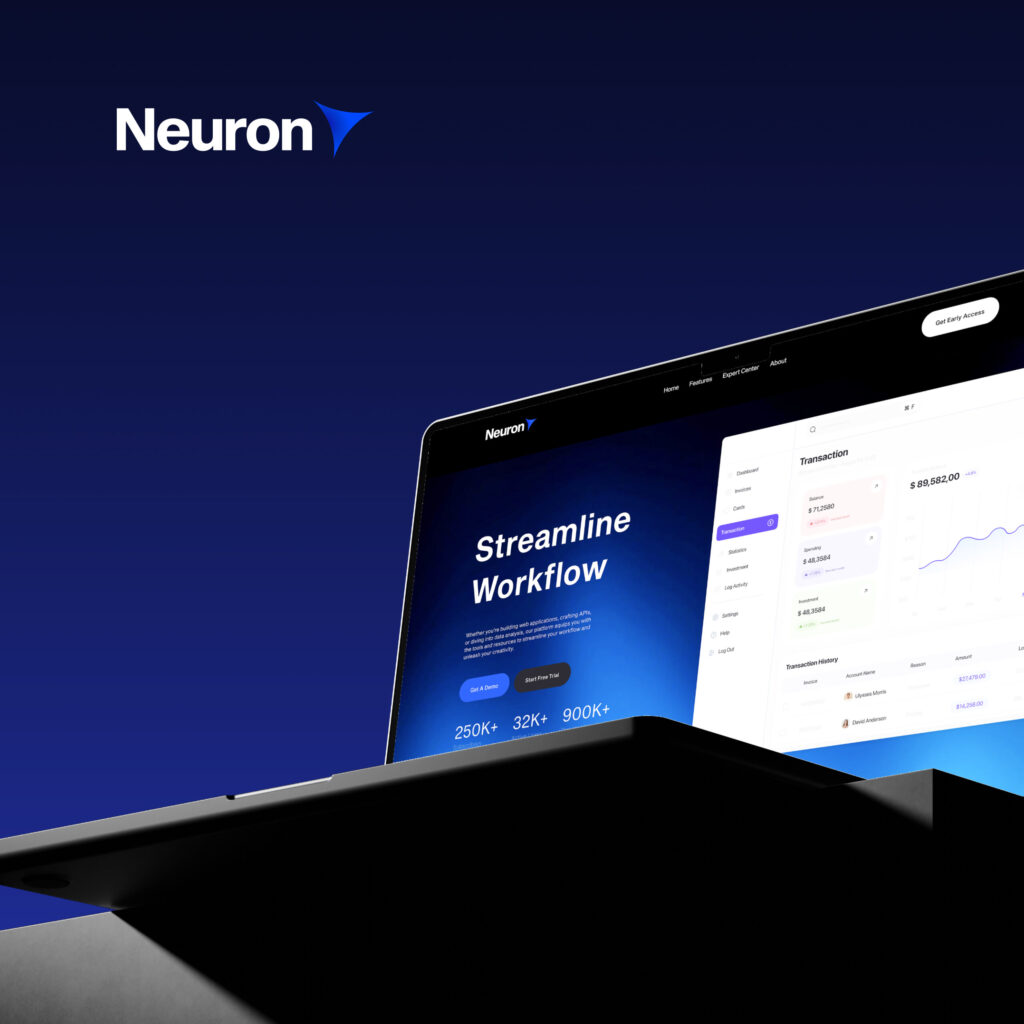
Neuron
We helped launch Neuron, an AI startup for business consultants, by creating everything from the name to the product UI. Our work unified brand, web, and pitch materials to tell a cohesive story from day one.
VLS
For VLS’s clinical reports, clarity came first. We restructured content and designed accessible infographics to serve both medical professionals and new patients—ensuring critical health info is easy to scan and understand.
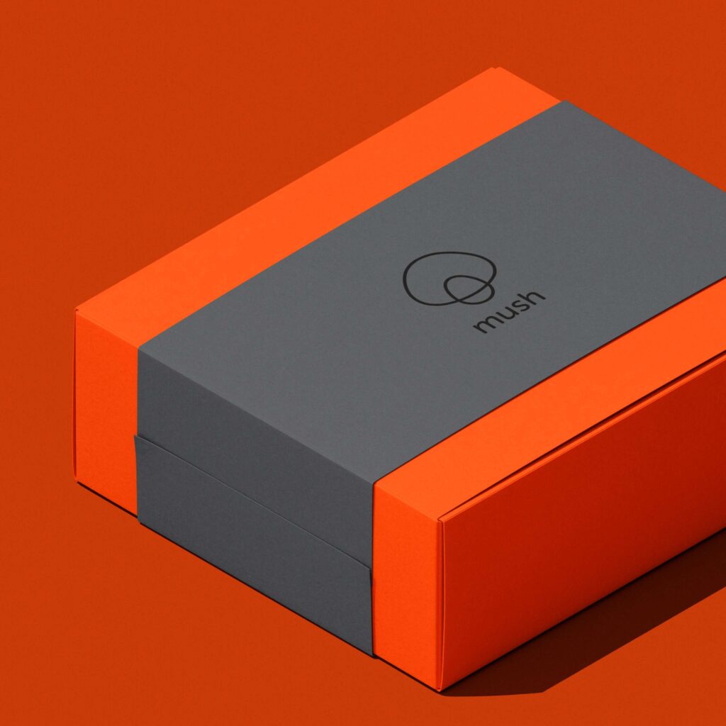
Mush
Mush, an adult-focused entertainment brand, needed identity with flair. Our logo—two simple rings forming a mushroom—evokes magic, play, and transformation, flexing seamlessly across motion, merchandise, and media.
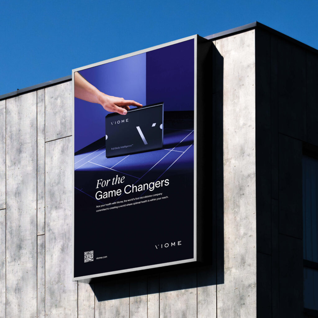
Viome
With a 24-hour deadline, we created a minimalist yet bold print ad for Viome at the US Open. By transforming a tennis court into a stage for the product, we delivered a striking visual that rose above the clutter.
Hanrad
We designed a bespoke typographic logo for Hanrad, a luxury rug brand inspired by fine art. Every letterform was sculpted to reflect timeless elegance—mirroring the craftsmanship of the masterpieces their rugs are meant to complement.